
- Home |
- Vintage
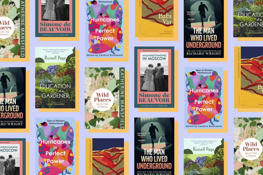
Vintage
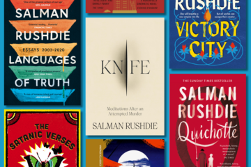
New books from Vintage

Quiz
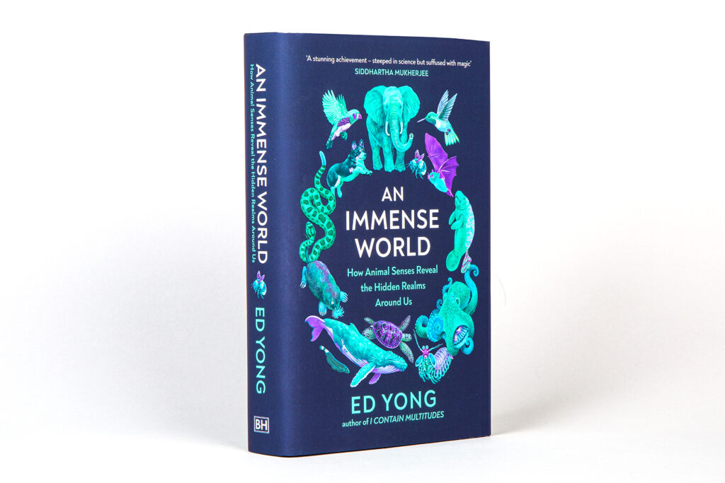
How much do you know about animal senses?
Inspired by Ed Yong’s An Immense World, take our quiz to find out just how much you know about how different animals perceive their environments.

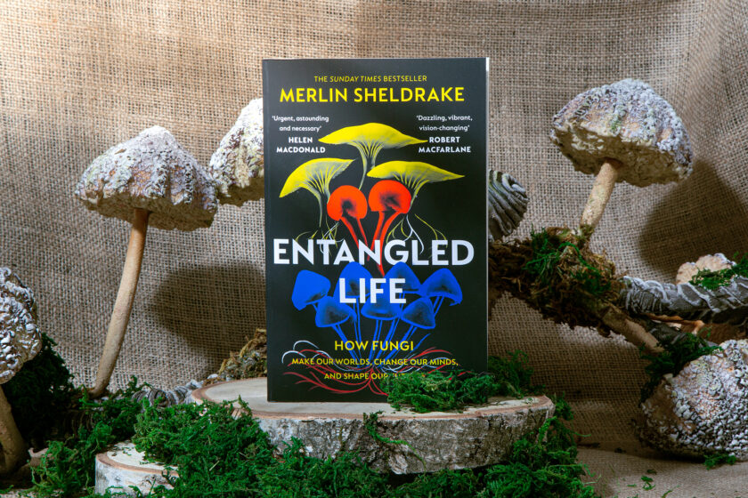
Vintage paperbacks
Recommended reading
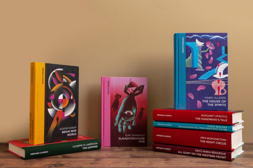
Vintage Classics

Vintage American Gothic
Spine-tingling, mind-altering and deliciously atmospheric, journey into the dark side of America with nine of its most uncanny classics.
Vintage Classics recommended reading


Penguin Shop
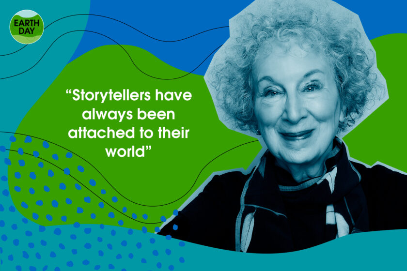
Vintage Earth Series
Discover great writing on the most urgent story of our times.
Eight wild, surprising and essential reads have been brought together in the beautifully designed Vintage Earth collection, a series of outstanding writing on the power and beauty of nature. Each of these transformative novels is a work of creative activism, a blast of fresh air, a seed from which change can grow.
Sign up to the Vintage Books newsletter
By signing up, I confirm that I'm over 16. To find out what personal data we collect and how we use it, please visit our Privacy Policy